How much do you, Gentle Readers, care about the way a document looks? When you look at web sites, brochures, books, do you think “Oh, what a beautiful (or ugly) type font”? (Probably not.) Even though the Futura font became associated with nasty people in the past, do you think less of someone who cluelessly chose Futura as his or her personal font? If you can read the words, is that good enough? Did you ever bother learning rules about the “meanings” of indented first lines, extra spaces between paragraphs, ragged or even right margins?
Probably not. Probably, if you do notice formatting, what you notice is that the combination of pale-colored type and “sans serif” fonts like Arial make things hard to read. If you cared a great deal about formatting you probably wouldn’t read anything on the Internet, where formatting is almost always sooo ugly.
I should begin by saying that most blog hosting sites, and social media sites, have their own formats they impose on users. I understand this and actually thank people for not trying to fix the default formatting imposed by the public sites they use, because it's easier for readers to fix the default formatting when we paste it into Word and print it, anyway. In this post I'm scolding Microsoft, not my e-friends. But I am scolding Microsoft, and HP, and Open Office.
I should begin by saying that most blog hosting sites, and social media sites, have their own formats they impose on users. I understand this and actually thank people for not trying to fix the default formatting imposed by the public sites they use, because it's easier for readers to fix the default formatting when we paste it into Word and print it, anyway. In this post I'm scolding Microsoft, not my e-friends. But I am scolding Microsoft, and HP, and Open Office.
Formatting is used to communicate, not just to make a personal statement. Here are some rules you may or may not have formally learned:
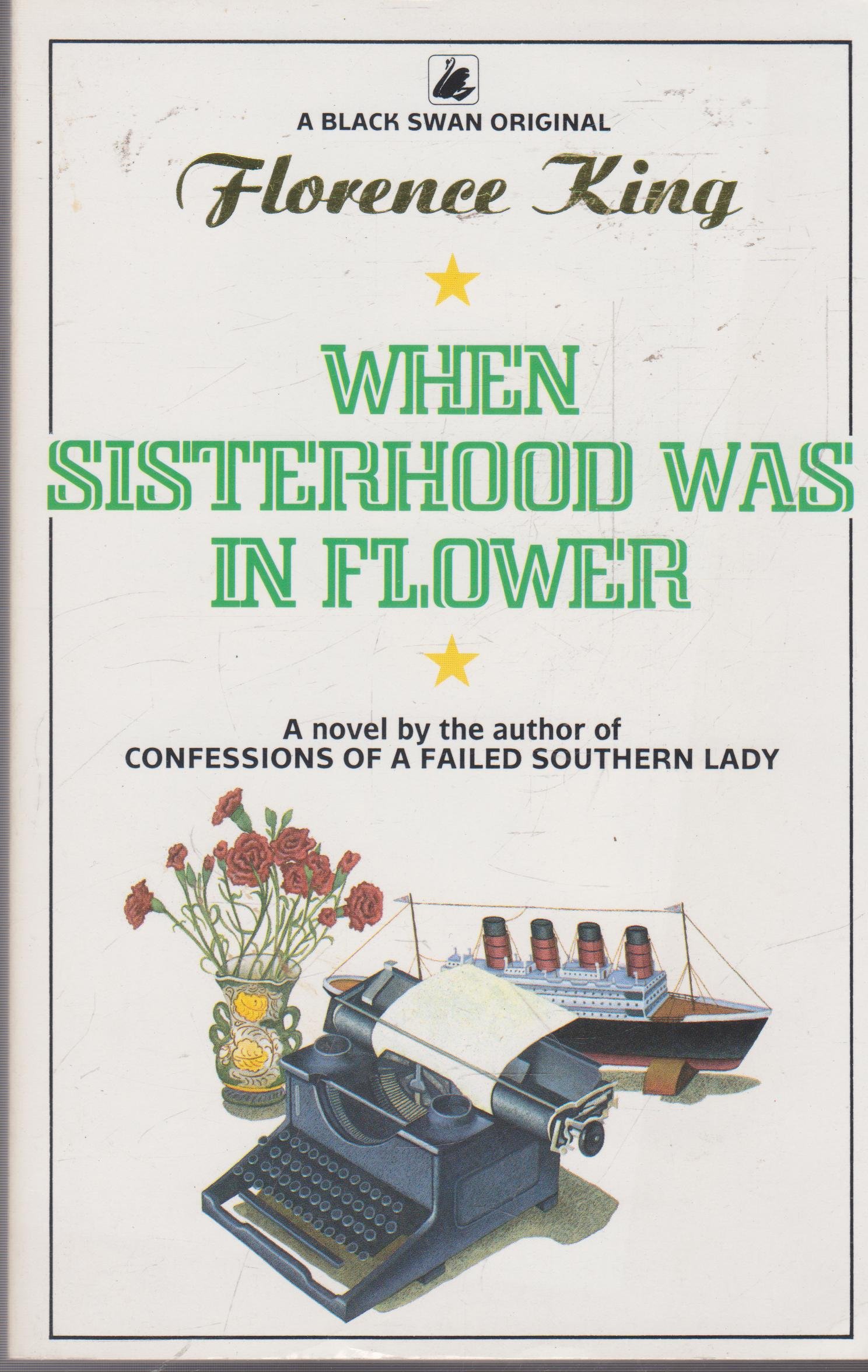
* On a printed page, small type generally says “I respect you; I’m not trying to deliver less than your money’s worth.” Large type is fine for headings, or in books specially marked as “Large Print” for weaker eyes. Otherwise, bigger letters say “I’m using more space to deliver less content.” (See Florence King, as in When Sisterhood Was in Flower, for (hilarious, not-family-filtered) descriptions of bored hack writers using bigger type and other devices to crank out more variations on what they typed last week.) This is also applicable to extra spaces between and among lines, words, or letters.

* On a computer screen, however, the screen itself is tiring to the eye, and larger print seems easier to read faster. Web sites normally display content in type sizes that would be obnoxious in a book. On the Internet people are only scanning; if we really want to read a document we can resize the type to whatever we prefer when we print the document.
* In a bound book, uneven right margins say “This is meant to be a poem.” (And if it is, in fact, the instructions for using a gadget, it will be unfavorably judged for that reason. Ragged-edged prose is annnoying.)
* On loose leaves of paper, uneven right margins say “This is a draft, a student’s paper, or a personal letter, hand written or typed on a typewriter, not yet ready to be printed and published.” Extra space between lines says “This draft is being submitted for corrections.”
* On a computer screen, uneven right margins say “This is a web page. Even if the document is ready to be printed, it’s too complicated to get the right side nice and even when we have to use extra-large type.”
* On a printed page, a paragraph that follows immediately after the preceding paragraph is not separated by extra spaces, but by a line break and an indented first line. This says, “Here is step two (after step one), or what B said in reply to A, or the next point the reviewer wanted to raise in discussing the book.”
* On a printed page, extra spaces between paragraphs say, “Here is a separate thought...maybe what happened to a different character in the story, or what happened hours or days later, or the number to call if steps one through ten don’t work.”
* On a computer screen, extra spaces between paragraphs say, “This may or may not be a following thought, a separate thought, or a whole different document. Extra spaces have no real meaning because many web designers still have trouble designing pages that display paragraphs properly. Both extra spaces and strange characters may mean that the computer was scanning the document as it was typed in on a different computer, and inserted stuff where the original document formed line breaks.”
* On a printed page, either the first line of each paragraph, or all the successive lines, are indented. This says “This is a paragraph.” The first line is indented in ordinary prose; the following lines are indented in lists. The very first line of a book or chapter is not indented and may feature an extra-large first letter, graphic, or some other sort of fancy formatting; this says “This is a new document.” Paragraphs that lack indentation, after the first line, say “This is a mistake.”
* In a business letter, there is a traditional “block style” that uses extra lines in between unindented paragraphs. This, along with funky-looking fonts like Futura, is associated with early twentieth century “progressivism” and with Europe. These features say different things to different people depending on their politics, but in any case they’re not a beautiful style. Americans favor typefonts with serifs and paragraphs with indentation.
* On a computer screen, paragraphs that lack indentation say “This is the careless mistake of Web designers who, by and large, were not book editors and didn’t know how to get paragraphs to look right.” (Or did they? Some of them were, in fact, left-wingnuts.)
* If a printed document has more than one page, printing on only one side of each page says either “Use this side for notes, answers, comments, etc.,” or else “We waste a lot of space and paper, and probably other things.” The convention of single-sided business documents goes back to the nineteenth century, when quill pens and fresh typewriter ribbons used liquid ink that could soak through the thin, cheap paper many people used, so that documents typed on the paper many businesses used could become unreadable. People who developed their style before 1970 became accustomed to reading single-sided documents and are confused by text printed on both sides of the paper. For baby-boomers, however, one-sided printing has never been necessary.
* If a document prints from a computer on only one side of each page, that says “Despite all the blather you used to hear from computer people about saving paper, and despite the fact that writing on a word processor does save professional writers a lot of paper, the computer printer industry is still a greedhead business that’s more concerned about making people buy more paper than it is about saving any trees.”
* Despite the potential different typefonts and colored inks offer for organizing material—identifying different levels of headings in nonfiction, different narrators in fiction, etc.—generally, “special effects” beyond a header font and a main text font say “I’m a child playing with a toy.”
* In handwritten documents, underlining says, “This is either a word someone emphasized when speaking, or a foreign word, or a book title.” In hand-typed documents underlining was supposed to serve the same purpose, but that took a lot of time and wasted a lot of single-use film ribbon, so capital letters were sometimes used to say the same thing.
* In printed documents, italic type normally says the same thing as underlining.
* On a computer screen, all capitals says, “I’m screaming.” No capitals says, “I’m mumbling.” Nearly all web sites will display italics, and nearly all online writers have learned to type “< i >” and “< /i >,” so italics have generally been adopted for use in identifying emphasized words, foreign words, and book titles in online documents. But not always. There’s no consistent rule. Young readers may need to be told that typing words between *asterisks* or /slanted lines/ were older ways to get either bold or italic type to display on a screen; they still work at a few sites and are still often used where they don’t work because that’s a habit older people developed. Baby-boomers, at least, “hear” a word being emphasized differently if it’s typed between asterisks (usually to show harmless contrastive stress, as in “Please note, I want to do this on Monday (rather than Tuesday as usual)” ) or in capital letters (usually to show the more unpleasant kind of stress, as in “You agreed to do this on MONDAY!”).
In the 1980s, a person could make a decent living just by learning how to make the clunky word processing systems of those days print documents that looked as if they’d been printed by people who knew these rules, and others, which we’d probably not studied in school but absorbed by studying printed books. It was possible to establish a real trademark “style” through formatting in sophisticated programs like Word Perfect or Microsoft Word. I did. While some favored styles that proclaimed “I am trendy and arty,” mine proclaimed “I can make your software manual look like a real book that Houghton Mifflin might have printed.” I made more money than the trendy and arty typists in the 1980s.
Newer versions of Word actually came out with some of my preferences, which were also the preferences of many federal agencies and contractors, set as defaults (after it had taken us years to get them into computers as options). My trademark formatting no longer displays in Word at the length it once did. It has variations, but basically...
* Margins: 0.5” all sides
* Font: Times New Roman 8 pt
* Line spacing: Single
* Tab stops: 0.25”, 0.5”, 1”, 1.5” (etc.)
* Paragraphs: first line indented by 0.25”
* Alignment: Justified
* Font color: Black
* DON’T (waste a line to avoid printing the last line of a paragraph on a separate page)
* DON’T (add spaces between paragraphs)
* DON’T automatically “correct” ANYthing.
* DON’T automatically number lists
Deviations from this norm serve special purposes and are done by hand. Even I don’t always format everything exactly the same way, and in fact I have templates for “list,” “poem,” “manuscript,” “business letter,” and “large print” documents that are different from the basic prose document, but basically, if it’s prose and I wrote or typed it, there are specific reasons for any deviation from my norm; this is generally the way I want my documents to look. Clean, classic, conservative, with no wasted space. A glance should make it clear that they’re meant to be read on paper, by people who know the difference between sections and paragraphs.
I’d been setting up documents like this before Word existed, so I was dismayed when I took documents to a certain computer center to print and found that everything I uploaded was coming up in what I see as a horrid, nasty, ugly...Webby-looking format. New versions of Word were overriding all my own formatting and mangling my documents into big ugly type fonts with unindented paragraphs and extra lines everywhere. Urgh! Ick! Where was this garbage coming from? Nothing typed by me should ever look like that, I silently screamed.
Whence, I asked myself, all this passionate intensity? I’ve typed all kinds of things that don’t look like my default Word settings. I type things to fit other people’s specifications. I type things that aren’t normal prose documents. When I focus more intensely on something by “reading it into the computer,” I don’t always bother to print the samizdat copy I’ve made, but when I do I long ago formed the habit of printing samizdat in all those other fonts, if only to have a sample of what they look like in case I type something for someone who wants it to look a bit different. Some fonts, as the main fonts for an entire document, look ridiculous—so now I know that, too. I would not, ever, recommend Arial or Calibri or Tahoma or any other sans-serif font for anything that anyone needs actually to read, because not only i’s and l’s and 1’s and I’s but also f’s and t’s come out looking exactly alike to most people, as do 3's and 5's and 6's and 8's and 9's, but how hard is it to type CTRL+A, click on the Font menu, and click on “Times New Roman”?
Well, for one thing, I should not ever need to do that. People who upload documents onto public-access computers are uploading the documents they want, the way they want those documents to look. Their time is usually limited, and they’re not there to clean up Microsoft’s mess. It’s really a point of common courtesy, given that other people may be waiting in line to use a public-access computer, to program the public-access computer not to change a document in any way.
For another thing, though, why are the new versions of Word so determined to change formatting designed for printing into formatting designed for online viewing? I don’t want my documents to be viewed online. I want to get them printed out so I can read them, myself. Who else wants to read my documents online, and wants me to know they’re reading my documents online, and wants to expose their nefarious activity by something as rude and clumsy as changing my formatting?
Why would Microsoft annoy customers in this way if someone weren’t paying for the information they hope to gank out of our private documents?
Who would pay for the Word documents of private people is an even murkier question. Frustrated advertisers, hoping that if they keep reading our mail they’ll find the magic keyword that will motivate us to buy something we’ve never wanted to own? Local telephone company employees, hoping to find tidbits of gossip they’ve not been able to overhear on the phone?
Word’s obnoxious “Styles” feature is obviously not designed for the convenience of typists, who have never needed a computer to tell them that in a business letter the dateline should be aligned right, the address aligned left. We can do that with one keystroke so why would we want to bother programming it into a bunch of burdensome “Style” buttons? The only explanation for the “Styles” feature that makes any sense at all is that someone you’ve never been told about really wants to read the letters you don’t trust to e-mail.
Such things have their uses if they remind us never to type anything that mentions real names or physical addresses on a computer that has a modem. Still, they’re a pain. When I print something I typed for my own benefit, I do not want it to screech nonverbally “This is an ugly, amateurish-looking web page”—it’s not a web page. I did not take the trouble to center the chapter headings so that a computer could left-align them, or to fit a tidy little document into fifteen neat-looking pages of Times Roman so that a computer could spread it out into forty ugly pages of Calibri. (Funny thing, if Microsoft hadn’t started messing up my documents with its idiotic preset “Styles,” I wouldn’t hate Calibri.) I did not type a document in Spanish so that a computer could suggest English words that look similar to the words I mean. I want a computer to “know” that it’s a machine, not a nanny.
Recently, I’ve started seeing a message when I open Word that “Word has saved changes to the ‘Normal’ template.” I didn’t make those changes. Somebody Out There in cyberspace wants to take back the benefit people bought Word for: the way even two-finger typists can use Word to make documents look the way they like. Something I downloaded contained an embedded command to “update the template” and restore some aspect of that tacky Webby look to my documents.
Stop it right now, Microsoft. No document of mine contains wasted spaces between paragraphs. A blank line after a paragraph is a section break and there should not usually be more than one on a page. Maybe you could upgrade whatever the other person was using to embed a permanent setting that Does Not Allow the Document to Alter a User’s “Normal” Template.
Better yet, when you roll out Windows Respects the Customers Edition with Minimized Connectivity, Physical Data Storage, and Text-Only Browsing, don’t have “Styles” buttons at all. Early adopters still remember how to set up their own templates as document forms. If we, the Honorable Customers to Whom You Owe Thanks for the Shirts on Your Backs, want to use those templates we can use them. Keep your silly “Styles” to yourself. Whoever’s unofficially monitoring my private word processing system can jollywell enlarge the type manually.
Program this into Word, Microsoft: The computer owner’s commands shall prevail, even if the computer owner were foolish enough to want to use webby-looking formatting. The spyware that doesn’t like the owner’s formatting choices shall vaporize.
No comments:
Post a Comment