For a while it was traditional in France to wrap books in plain white or colored covers with no art at all, and I like this approach to book design. What needs to be clear on the book cover are the title and the author's name. Substitles can also be useful, especially when somebody wants to recycle a phrase from a song or poem into a book title; it is polite to make it clear on the cover whether a book called We Merrily Put to Sea is a collection of folk songs, a novel that takes place on a cruise ship, or a beginner's guide to sailboats.
But adding cover art adds little to the cost of printing a book. Unfortunately, the publisher usually pays the artist once--often less than the painting or drawing is worth--and thereafter "owns" the image. Artists are as badly treated by our culture as writers, so why not at least give them a little publicity. Most publishers nowadays spend a little money on cover art. Often the amount they're willing to spend seems to determine the amount of skill applied to the artwork. Books are decorated with sketches or mere blobs of color that add no value; they'd look better with plain white or colored covers.
Cover art should be a guide to what is inside a book. Misleading cover art is bad. People who are looking for simple instruction books may laugh if the cover suggests a dramatic story--is the person modelling the clothes or holding up the birdhouse going to tell us how she coped with the screaming toddler or the person who collapsed onto the front of her car?--but people who are looking for dramatic stories will be disappointed. When the crafter showing these people the book tries to recall their attention to its purpose, that disappointment is in the way.
"Wow! Did they hit her, or did she just pass out drunk on that car?"
"I don't know. Maybe they were reenacting some sort of movie? Anyway, to make that sweater in your size would cost..."
"What else do they have? I don't want that sweater."
Don't ask me how I know.
Cover art should generally follow the standard rules of composition: focal point near the center, some sense of balance overall, and, if human figures must be included, avoid separating heads from necks. Nobody complains if the model's hand or foot or whole body up to the third rib has been "cut off," but some people fret if a head or part of a head has been "cut off," no matter how much better the focal point--the sweater, or birdhouse, or twelve-pound fish hanging from the line--looks without the head.
Cover art should be tasteful. Landscapes, objects, or geometric patterns are preferable to human figures, even on the cover of a novel about people, simply because it's so much easier for artists to do them justice. Faces can turn readers against the book--"Who wants to read about anybody who looks like that?"
Human figures should be fully clothed, although a person with a toga or sari over one shoulder is not considered "topless."
(Someone recently complained that the Virginia flag portrays a "topless" woman standing, or one might say stamping, on a fallen man. It does show Lady Justice standing triumphant on the body of defeated Tyranny, but Justice is draped in white silk as an ancient Roman goddess should be. If you imagine that you're looking at something less conservative than a Roman palla wrapped over one shoulder and under the other, you are not from Virginia and can avoid further embarrassment by keeping your lack of a classical education to yourself.)
Even medical books look better with a plain background for a title like The Wonderful Armpit or Six Weeks to Prettier Pores, but if a body part must be portrayed, it's always better to show an "after" picture. Lean, fit bodies of all shapes and sizes, in clothes, rather than flabby body shapes. Clear, smooth skin, rather than inflamed acne. A woman holding a baby, rather than a baby bump. If for some reason the cover art must allude to the end of life, a closed coffin is preferable to a presumably dead face, even if the face in question is made of plastic. And if it's about sex, the universal code is two people, upright, looking at each other.
Even the best cover art is merely a decoration. The book would be just as good without it. Nevertheless, a few book covers do come to mind as being especially appealing...
Last Chance to See by Douglas Adams
(Drat. Amazon doesn't even have an image of the original cover.)
There are more lifelike paintings but this one's richly textured effects made me think of knitting...and I designed a patchwork blanket to go with this book. The blanket was donated to a Ronald McDonald House, because the design challenge came from a yarn company that had designated that charity as the destination for designs.
Not What You Expected by Joan Aiken

These short, whimsical, often funny and also sometimes sad stories are suitable for ages 5 to 105, and after saying that they were based on dreams, the best way to describe the stories, individually or together, is the title of the book.
Black Black Beautiful Black by ?
[Amazon doesn't have a copy.]
It's not political. (It's not one of the "Black Is Beautiful" books Amazon still has in stock.) It's based on physiology. There is a biochemical in our eyes called "visual purple." Looking at white, red, and yellow things depletes it. Looking at black, blue, and green things restores it. After a long day of school, writing, or office work a little book consisting of plain black paper is very pleasing to our tired eyes. Because of its size, this one was shelved as a child's picture book when I was a child. I didn't appreciate the concept then but I do now.
To the Green Mountains by Eleanor Cameron

Any of the Appalachian Mountains on which you're standing is green, with brown and colors showing through. Any other of the Appalachian Mountains to which you're looking across is intensely green, as shown. Only at a distance do they look blue or smoky.
The Cats of Thistle Hill by Roger Caras

In which he makes the not exactly novel observation that, if you have enough land and all the animals involved are neutered, a surprising number of dogs, cats, and other lifeforms can live together in peace. But the cover art was lovely.
The Gammage Cup by Carol Kendall
(Amazon has copies, but if covers are shown they're for reprints.)
It's just so green...and the story inside is Green, too. In this story people who live off the land are heroes who save the town they've moved out of. There's a sequel where the characters defend their river from dammers and polluters.
The Bible Story by Arthur S. Maxwell
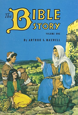
How much waiting room time did you spend with Volume 1 of Maxwell's ten-volume Bible story books? Before you learned to read, you probably learned that this painting meant "More Pretty Pictures Inside."
Dragon Song by Anne McCaffrey

The cover of the first hardcover edition was dreadful--a face badly drawn in bright tomato red. The paperback edition made up for it with a pool of sea-and-beach-colored wavelets. I don't think any two copies faded quite alike but I always enjoyed trying to count the colors in those wavelets.
The Mysterious Disappearance of Leon I Mean Noel by Ellen Raskin
(Amazon has lots of reprints but no image of the original hardcover edition.)
It's not what I'd usually call pretty but the cover suits the story well.
Life at Its Best by Ellen G. White

One of the best uses of cover art ever made was the use of this painting to sell short, readable selections from a long, sententious, Victorian book.
Wrapping books in coloured paper is an interesting idea. It's usually the colours on a cover I'm drawn to more than anything else.
ReplyDeleteThis was me, Priscilla. For some reason I was anonymous 😂
DeleteThat's Google for us. Thank you for visiting :-)
DeleteI like that French tradition!
ReplyDeleteI do too! Thank you for visiting.
DeleteInteresting re: plain covers. When I worked at the library, we would do that occasionally...wrap books in brown paper and only put the genre on it... fun.
ReplyDeleteOoops... forgot to change the anon... Judy here. And thanks for coming by!!
DeleteBROWN wrappers? "The Plain Brown Wrapper" used to mean censored content! Lol. Thank you for coming by, too.
DeletePK