Showing posts with label art. Show all posts

Friday, June 5, 2026

Book Review: Country Friends Good Times

Title: Country Friends (TM) Good Times

Author: Gooseberry Patch Co.

Date: 1998

Publisher: Gooseberry Patch Co. 

ISBN: 1-888052-27-9

Length: 216 pages

Quote: "Treat yourself to a good friend."

In Ohio there is a town called Delaware. In that town two women, "Jo Ann" and "Vickie," and a few more of their friends off and on, set up a mail-order business called the Gooseberry Patch Company. They sold cute, whimsical, handwritten-looking books like this one, which is primarily a book of suggestions about cheap ways to have fun. Not necessarily the healthiest ways--they trust the reader's judgment about how many sugary or cheesy food treats will really be fun--but generally cheap ways. 

"Gooseberry Patch Co." sold out to a larger publisher but still exists as an imprint; they still have a few hundred cute little cookbooks in print. Well, if you count books like this as a cookbook. The majority of instructions and suggestions in these 216 pages are not for cooking but a recipe index does count 49 recipes for things some people will eat.

Maybe the best way to describe this book is to flip through the pages and give the suggestion at the top of five or six pages:

* Decorate a plain flowerpot with a cute little gift label (you could photocopy theirs from the book), put in some potting soil and a flower bud or seedling, and give it to a friend.

* Darn a sock by saying "Oh, darn!" and throwing it away. (Well, that's a joke. This web site knows several things to do with a worn-out sock that are more fun.)

* Start a good friends' gathering club. 

* Host an "ice cream social" party. For invitations, stick a little card giving the time and place information in green paper or plastic "glass" in an actual ice cream cone and hand one to each person invited.

* Exercise like a kid...jump rope!

* Make a gift basket for a tea loving friend: paper doilies, a tin of very special tea, a loaf of homemade bread, a jar of preserves, a lacy napkin, a beautiful antique china teacup, and a pretty jar of lemon sugar. 

Feel-good reading, for sure. The emphasis on friends, kids, and going out means that these suggestions can help cure "depression." One of the leading causes of "depression" is lack of physical activity, and these antidepressant activities will inspire almost anybody to turn off the TV, get off the couch, and do something that is fun that involves a nice low-stress level of physical activity. If these things don't help, there may be an underlying physical cause. At least it helps to rule out lack of exercise before testing for more complicated conditions.

Friday, November 7, 2025

Bad Poetry: Emilie's Letter to Bertram

This week's Poets & Storytellers prompt invites us to write about edges. One of this week's DVerse prompts invited poems about Mary Cassatt's painting, "The Letter."


Of course I can't see you again
she's written. As she licks the edge
to seal the envelope, a pain
runs through her like a sharpened wedge.
She'll miss him. What would Papa say 
if she did not turn him away
now that he's been demoted down
to private, having been one week
a Sergeant First Class. In a town
a drunken lout, who'd come to seek
a quarrel, said she looked too fat.
He knocked him down. How bad was that?

Wednesday, June 4, 2025

Book Covers I Love and Why

As we've all heard, you can't judge a book by its cover. The cover can be, at best, a general guide to the kind of book it is. That doesn't mean that cover art can't be beautiful; it means that the best books don't necessarily have any cover art at al, and the best cover art may cover disappointing books. 

For a while it was traditional in France to wrap books in plain white or colored covers with no art at all, and I like this approach to book design. What needs to be clear on the book cover are the title and the author's name. Substitles can also be useful, especially when somebody wants to recycle a phrase from a song or poem into a book title; it is polite to make it clear on the cover whether a book called We Merrily Put to Sea is a collection of folk songs, a novel that takes place on a cruise ship, or a beginner's guide to sailboats. 

But adding cover art adds little to the cost of printing a book. Unfortunately, the publisher usually pays the artist once--often less than the painting or drawing is worth--and thereafter "owns" the image. Artists are as badly treated by our culture as writers, so why not at least give them a little publicity. Most publishers nowadays spend a little money on cover art. Often the amount they're willing to spend seems to determine the amount of skill applied to the artwork. Books are decorated with sketches or mere blobs of color that add no value; they'd look better with plain white or colored covers. 

Cover art should be a guide to what is inside a book. Misleading cover art is bad. People who are looking for simple instruction books may laugh if the cover suggests a dramatic story--is the person modelling the clothes or holding up the birdhouse going to tell us how she coped with the screaming toddler or the person who collapsed onto the front of her car?--but people who are looking for dramatic stories will be disappointed. When the crafter showing these people the book tries to recall their attention to its purpose, that disappointment is in the way. 

 "Wow! Did they hit her, or did she just pass out drunk on that car?" 

"I don't know. Maybe they were reenacting some sort of movie? Anyway, to make that sweater in your size would cost..." 

"What else do they have? I don't want that sweater." 

Don't ask me how I know. 

Cover art should generally follow the standard rules of composition: focal point near the center, some sense of balance overall, and, if human figures must be included, avoid separating heads from necks. Nobody complains if the model's hand or foot or whole body up to the third rib has been "cut off," but some people fret if a head or part of a head has been "cut off," no matter how much better the focal point--the sweater, or birdhouse, or twelve-pound fish hanging from the line--looks without the head. 

Cover art should be tasteful. Landscapes, objects, or geometric patterns are preferable to human figures, even on the cover of a novel about people, simply because it's so much easier for artists to do them justice. Faces can turn readers against the book--"Who wants to read about anybody who looks like that?" Human figures should be fully clothed, although a person with a toga or sari over one shoulder is not considered "topless." 

(Someone recently complained that the Virginia flag portrays a "topless" woman standing, or one might say stamping, on a fallen man. It does show Lady Justice standing triumphant on the body of defeated Tyranny, but Justice is draped in white silk as an ancient Roman goddess should be. If you imagine that you're looking at something less conservative than a Roman palla wrapped over one shoulder and under the other, you are not from Virginia and can avoid further embarrassment by keeping your lack of a classical education to yourself.) 

Even medical books look better with a plain background for a title like The Wonderful Armpit or Six Weeks to Prettier Pores, but if a body part must be portrayed, it's always better to show an "after" picture. Lean, fit bodies of all shapes and sizes, in clothes, rather than flabby body shapes. Clear, smooth skin, rather than inflamed acne. A woman holding a baby, rather than a baby bump. If for some reason the cover art must allude to the end of life, a closed coffin is preferable to a presumably dead face, even if the face in question is made of plastic. And if it's about sex, the universal code is two people, upright, looking at each other. 

Even the best cover art is merely a decoration. The book would be just as good without it. Nevertheless, a few book covers do come to mind as being especially appealing... 

Last Chance to See by Douglas Adams 

(Drat. Amazon doesn't even have an image of the original cover.)

There are more lifelike paintings but this one's richly textured effects made me think of knitting...and I designed a patchwork blanket to go with this book. The blanket was donated to a Ronald McDonald House, because the design challenge came from a yarn company that had designated that charity as the destination for designs.

Not What You Expected by Joan Aiken 


These short, whimsical, often funny and also sometimes sad stories are suitable for ages 5 to 105, and after saying that they were based on dreams, the best way to describe the stories, individually or together, is the title of the book. 

Black Black Beautiful Black by ?

[Amazon doesn't have a copy.] 

It's not political. (It's not one of the "Black Is Beautiful" books Amazon still has in stock.) It's based on physiology. There is a biochemical in our eyes called "visual purple." Looking at white, red, and yellow things depletes it. Looking at black, blue, and green things restores it. After a long day of school, writing, or office work a little book consisting of plain black paper is very pleasing to our tired eyes. Because of its size, this one was shelved as a child's picture book when I was a child. I didn't appreciate the concept then but I do now.

To the Green Mountains by Eleanor Cameron 


Any of the Appalachian Mountains on which you're standing is green, with brown and colors showing through. Any other of the Appalachian Mountains to which you're looking across is intensely green, as shown. Only at a distance do they look blue or smoky. 

The Cats of Thistle Hill by Roger Caras


 In which he makes the not exactly novel observation that, if you have enough land and all the animals involved are neutered, a surprising number of dogs, cats, and other lifeforms can live together in peace. But the cover art was lovely. 

The Gammage Cup by Carol Kendall 

(Amazon has copies, but if covers are shown they're for reprints.)

It's just so green...and the story inside is Green, too. In this story people who live off the land are heroes who save the town they've moved out of. There's a sequel where the characters defend their river from dammers and polluters.

The Bible Story by Arthur S. Maxwell 


How much waiting room time did you spend with Volume 1 of Maxwell's ten-volume Bible story books? Before you learned to read, you probably learned that this painting meant "More Pretty Pictures Inside." 

Dragon Song by Anne McCaffrey 


The cover of the first hardcover edition was dreadful--a face badly drawn in bright tomato red. The paperback edition made up for it with a pool of sea-and-beach-colored wavelets. I don't think any two copies faded quite alike but I always enjoyed trying to count the colors in those wavelets.

The Mysterious Disappearance of Leon I Mean Noel by Ellen Raskin 

(Amazon has lots of reprints but no image of the original hardcover edition.)

It's not what I'd usually call pretty but the cover suits the story well. 

Life at Its Best by Ellen G. White


One of the best uses of cover art ever made was the use of this painting to sell short, readable selections from a long, sententious, Victorian book.

Tuesday, March 25, 2025

Book Review: Creative Visualization

Title: Creative Visualization 

Author: Valerie Martin

Publisher: Opal Tree

Date: 2016

ISBN: 978-1919636368

Quote: "This book is intended for inspiration purposes only, for people who have an interest in developing their creative practice."

A classic work of its era called Creative Visualization was published in 1978. For this mini-book to be released under the same title invites comparisons. Not all of the comparisons are unfavorable--the author known as Shakti Gawain had to spend more time selling the idea of "creative visualization" than guiding visualization exercises, and did not, in fact, include more exercises in her full-length book than Val Martin does in this little e-book. Nevertheless: Gawain's book was groundbreaking; Martin's is a rehash, even a digest. 

If you find it helpful to visualize yourself walking through beautiful landscapes and reaching insights into a "creative" project on which you're feeling blocked, here are fourteen visualization exercises. I find it interesting, and illuminating, that Julia Cameron said nothing about visualizing the walk but advised her audience of artists to do the walk. For me the visualization might be a substitute worth trying if I were laid up with an injury, but I can't say I've ever used it with success. If insights are down in the well of my unconscious mind, they rise to the surface when I apply the outside of my feet to the outside of the Earth. 

At least Martin's visualizations are so pretty that they're likely to suggest a lovely romance, or reconciliation, or some sort of happy-ending scene for a novel, or a landscape for a feel-good painting. 

Thursday, August 29, 2024

Book or Art Film Review: The Lost Era Transcripts

This review was written when the e-book was finished. It's being reposted now that the movie has been released and is available for screening. This is a valuable piece of California history and also a feast of visual art, from pretty nature scenes to horror pictures. 


Title: The Lost Era Transcripts

Author: Peter Wade Hampton

Editor: John W. MacLean

Date: 2023 (movie, blog)

Quote: “Someday, Pete Hampton will be recognized as one of America’s great artists. I am going to have a role in making that happen”. 

Pete Hampton grew up at a peculiar time in southern California's history: a time when relatively generous amounts of rain had encouraged more diversity of wildlife than most people see there, and relatively few people had crowded the wildlife out. He painted his memories, not always with perfect accuracy, but with a determination to preserve the sights he'd seen. He documented what southern California looked like without smog, traffic, and billboards. 

As his book makes clear, Hampton was an anxious, nightmare-ridden child, and in his case nightmares seemed to be part of a manageable psychotic condition. He saw and loved the beauty of nature, and wanted to discourage people crowding in and urbanizing places where a few humans could coexist with that beauty. If he gained any other wisdom from what he'd seen, however, he failed to write it down. Maclean tells us that a publisher had wanted to publish his book, then backed out of it--possibly due to timing, but also possibly because the story doesn't end with Hampton outgrowing his nightmares. He still had them during his last illness; he died old, but raving in nightmares. People who think a story ought to provide an encouraging message, "This was an unpleasant situation; this is how the character(s) made it better," will be disappointed.

But, for Hampton, the story wasn't about him. It was about the time and place that deserved to be remembered, so far as possible preserved--even if his memories of that time and place were all wound up together with his nightmares. 

So he left behind a manuscript linking pretty nature paintings and nightmare paintings. I don't think the nightmare paintings are very disturbing to adults of steady nerves and clear consciences. They feature a lot of cartoonish monsters. He was a little boy; he'd heard nothing about the real horrors of war, even the "good" but horrible one in the 1940s. 

He left a younger artist friend (MacLean) the task of making his manuscript publishable as a book or a movie. The technical details were apparently quite tedious, but MacLean did the job well. The Lost Era Transcripts has become a documentary movie. When I offered to view the movie MacLean, charitably remembering my absurdly low visual attention span, sent a link to the manuscript in blog form, each chapter visible online as a blog post. The hand work of scrolling and clicking helped me focus on a book that's long on color pictures and short on words. 

It would make an excellent big heavy glossy gorgeous coffee-table book, for all who want their coffee tables to display an interest in California history, ecology, artists, dreamscapes, or any combination of those things. It would be expensive to print and might have to be published privately, or by a university, as a limited edition; but for art lovers these lively, quirky paintings would be worth their price. Hampton's heirs might even consider selling limited editions of frameable prints of individual paintings, full-sized or close. 

https://www.thelosteratranscripts.com/2020/05/the-lostera-transcripts-story-and.html

Wednesday, May 29, 2024

A Museum I'd Like to Visit

Today's Long and Short ReviewsLong and Short Reviews question is a difficult one for me to answer tactfully. What museum would I like to visit?

Oh well there's always something good at the dear old Smithsonian. There is so much of the Smithsonian. You could browse around there for a week, and something there would be deeply pleasing to have seen or heard. 

And, when visiting another town, it's always nice to visit the museum. There may or may not be much in it and what's in it may not leave much of an impression, but usually even the most pretentious and obnoxious "modern artists," even the ones who show their insecurity about copying traditional religious images by dumping garbage over their sculptures or inking mustaches on their Madonnas, manage to paint or sculpt or collect something that at least bemuses the eye. Sometimes small-town art museums do full displays of the work of some dear little pre-grandparent who's taken an art course to pass the time while the children went to school. Sometimes, whatever the shortcomings of the pre-grandparent's works, they're more charming than whatever the latest craze in New York might be. 

In the town of Wise, Virginia, there's a little gallery that specializes in displaying the best work of local college students, I always like to go there, especially with out-of-town guests. The students' work tends to be surprisingly good.  

But I have to say that, when I think about travelling, I think about natural phenomena I'd like to see in real life, wildlife, or people I'd like to spend time with, even research I'd like to do at libraries. I do not think about museums. I'm not yearning to see the Louvre, or the Victoria & Albert. If I had a valid reason to be in Paris or London I'd want to see their famous museums while there, but I wouldn't go to the cities to see the museums, and I'd want to save the museums for very cold or wet days. 

I feel about art the way I feel about poetry. When people just do what pleases them, the result usually pleases me too. When they've been stuffed full of notions, especially about the deconstructionist school and the need to shock the bourgeois and eschew what is "merely pretty," the result is usually just plain tacky. I don't like pretentiousness in art or poetry. I call my own poetry Bad Poetry (TM) and usually aim for comic rather than "serious," "High Art" effects. I like unpretentiousness in other people's art and poetry, too. If you paint a piece of plywood bright red and glue one grain of sand to it, as the hero of a comic novel I used to like did, you get an A for creativity in thinking of an art project at the last minute, but there is no way I'd buy it to hang on a wall--even in place of a paint-by-numbers piece rendered by someone else's grandchild. If anything I'd be more likely to shell out ten dollars for the paint-by-numbers piece. 

Thursday, May 9, 2024

Art Writing Is a Genre

Most readers of this web site are probably familiar with the term "ekphrastic," as used to describe a piece of writing that's directly connected to a piece of visual art. To understand the poem or story you need to see the picture. Whole novels have been written that way, like Joan Aiken's Girl from Paris. There are contests for ekphrastic poetry on the Internet every few months. But, with the shrinking of newspapers, is there still a market for prose writing about art? Do schools still require students to write in that genre? Do paying publishers ever print things adults write about art shows in museums?

The answer is yes. At least this British magazine does:


Giving me an excuse to post something I wrote in 1991...as a sample of the sort of thing college students used to write, and a few magazines and newspapers still print. If you're going to live in a city that has art galleries, where your friends are going to compete for invitations to display paintings, sculptures, woven wall art, etc., it's worth cultivating the art of writing about art displays. 

I didn't really intend to live in such a city; although I did, later, my husband and I went to more book parties than we did visual art displays. I saved this essay because it was the winner in a competitive game; a whole class went to the museum on a bus, leaving paper and pencils behind, and competed to see who could remember most artefacts afterward. Proof that I have more visual memory than I usually claim? No—proof that I was able to use my verbal, auditory memory to “write” the article in my head at the museum, then literally run to the computer center and type it. 

On rereading, what comes to mind is that I took Darryl Halbrooks’ technical skill for granted. Although most of his surreal artwork consisted of hostile sarcastic visual jokes, the jokes were offensive because the artwork “read” so clearly—the realistic details were well molded and painted. Good surreal art embeds realistic images within dreamscapes. I couldn’t say that Halbrooks’ three-dimensional cartoon figures resemble the almost photographic images that made Dalí famous, so instead I’ll say that my mental measurement for successful surreal art is the extent to which it reminds me of Dalí—and the Halbrooks collection did. At least the emphasis was on snarky jokes rather than scattered body parts.

Darryl Halbrooks, btw, is still alive, painting and sculpting. Digital images of his more recent work are at https://www.darrylhalbrooks.com/artwork.html .The snark content is still high; there's still a landscape formed from a collage of office clutter, still a medieval saint trying to cuddle a large snarling dog as if it were a baby. There's an impressive collection of paintings of scenes from vintage movies, and other themes and techniques that weren't really precedented in his 1991 exhibition. It's an interesting site to click around.

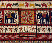
This post seemed to need a visual image. For Halbrooks images, you can visit his web site, so here's a picture from Google of a piece of elaborately woven fabric from India:


Photo from Artsy.com.

"Faces of India" & Recent Work by Darryl Halbrooks

I. Faces of India

1. Weaving. Several large pieces of woven fabric were displayed. One Indian word for fabric is sutra, which can refer to cloth or to the fabric of the universe. This brings to American minds the Kama Sutra, Kama being a Hindu deity associated with love, but the connection was not traced by the museum guide.

A sari was displayed with instructions on how the sari itself is wound around the body, tucked into the skirt, and draped over the blouse. According to an Indian legend, an elaborate sari once saved the life of a righteous lady. Enemies chased her and caught the end of her sari, but the lady prayed aloud as she danced out of their reach, unwinding her sari. Some say the sari miraculously stretched and unwound, stretched and unwound, for half a mile or more, until the lady reached a house where the enemies dared not follow her...still wrapped in the silken sheath-dress Indian women wear to show patriotic pride.

2. Photographs. Around one wall were several photographs of individuals and a landscape. Some people’s attention was caught by a photograph of an old man smoking a pipe and looking unusually contemplative. Others noticed a sequence of pictures of a young man demonstrating Yoga positions (asana), which are thought to promote transcendental-type meditation while they build strength and flexibility, or pictures of an extremely thin boy and a gaunt old man. I was most intrigued by the portrait of an old woman. Photographs rarely give me a sense of the subject’s personality except through the use of poses and props. This one did.

3. Dolls. Two fashion dolls were displayed on a stand. These dolls differ from European and American dolls by their costumes and by the exaggeration of their painted eyes. “Long eyes” are a feature of beautiful people as painted by Indian artists. I have heard Indian men, not necessarily Hindus, use “long eyes” or “lotus eyes” as Americans might use “blonde,” as a shorthand summary of conventional beauty. In the Hindu paintings on the wall behind the dolls, the characters’ eyes were even more exaggerated. It appears more grotesque than beautiful to the American observer, but then there are cultures in which blondness is considered unattractive too. Ear and nose ornaments were conspicuous in the dolls’ costumes, and also in the paintings. One doll wore a classic sari of loosely woven yellow fabric with lace borders. The other wore a rose-colored velvet gown whose close-fitting waist, sheer set-in sleeves gathered at wrists and shoulders, and plain long skirt could equally well have been accessorized as a European or Early American dress.

4. Paintings. One wall displayed a sequence of paintings illustrating episodes of the life of Krishna, a Hindu figure often described as Christlike. Hindu deities are said to have “blue blood” and Krishna could be identified in each picture by his blue-gray face. In the most bizarre painting Krishna is being nursed by a female giant with a monstrous tongue that coils through and around the baby’s fist. More conventional scenes show Krishna among ordinary people, in conversation ina courtyard, in rowboats, etc. 

5. Inadequacy. India is a very large country comprised of many different ethnic groups who follow different customs, practice different religions, and speak different languages. Despite government efforts to reduce the number of languages in use, still natives of India are not always able to talk naturally with one another. It would be impossible to get an adequate survey of Indian art into a room of this size, or make even a casual study of it in a one-hour visit. Many groups are completely ignored, even the substantial Muslim and Christian minorities.

The guide appeared nervous and not fully prepared to discuss the display. Instead his lecture was mostly about the reasons why American observers should not be prejudiced against Indian art. Since this American observer grew up with family friends who came from India and Pakistan, this lecture failed to make a favorable impression. More information on the artwork displayed would have been more useful.

II. Darryl Halbrooks

The guide appeared to take it for granted that the audience would prefer the exhibition of Styrofoam painting by Darryl Halbrooks. The observer heard at least two other visitors from Berea express a preference for “Faces of India.” I don’t feel that the two exhibitions can be compared. They represent different types of art (or craft) produced and displayed for different purposes. Although some of the Indian pieces expressed joy and merriment, none of them was a cartoon. The purpose of displaying them was to introduce Americans to Indian art. Most of the Halbrooks pieces were political cartoons. The purpose of displaying them was to prod Americans to reconsider various aspects of our own culture. These purposes may not be entirely incompatible but it would be hard to trace any connection between these collections.

1. Portrait: “Mi Madre.” Among the Halbrooks pieces, one titled “Mi Madre” did not suggest a sarcastic commentary on U.S. culture. This seemed to be a simple portrait in painted Styrofoam.

2. Animals. Two more paintings used dog images, one with an apparently wild dog pack and one with dogs’heads. No specific message was clear to this observer.

3. American Idolatries. The tone of the other Holbrooks pieces was compared by several observers to Gary Larson’s “Far Side” cartoons. Bombs and soda cans appeared in triptychs recalling the phrase, “Your ‘god’ is what you serve.” Americans “serve” bombs and warfare through taxes; individually, we “serve” favorite foods, drinks, and drugs. Another piece showed a bomb cradled in the arms of a madonnalike figure, presumably Lise Meitner, a physicist whose discoveries led to modern atomic science, so that she was nicknamed the “Mother of the Bomb.” The North and Northwest were portrayed by two creatures that might be wild dogs or wolverines, fighting below what I saw as the familiar faces on Mount Rushmore, badly copied. To Southerners this probably seems like a valid way to characterize this part of the country, nor are similar opinions unfamiliar to Canadians of my acquaintance. How this piece would impress a native of the northern border States, I don’t care to imagine.

4. “Open Demonstration of Affection.” My favorite of the Halbrooks pieces was this simple cartoon image, in which a human body is “opened” down the front to reveal the heart and other internal organs. I was once troubled by a plague of excessively evangelical Christians who used the undefined term “open” to describe some quality of human beings. This image came to my mind, too. An alternative had to do with the phrase “open slut”; I think Halbrooks chose the image that is more likely to suggest to those who describe people as “open” that this usage conveys no useful information. If they mean “interested” or “tolerant” or “sympathetic,” their purpose would be better served by one of those words. This cartoon has social value. It graphically illustrates something that needed to be said and has not been said many times before.

[Christians who describe people as "open," as if that were a good thing, might have been influenced by this 1948 essay recently reprinted in Plough Quarterly

https://www.plough.com/en/topics/faith/discipleship/get-ready-to-be-changed

In this specifically religious context the word usage makes sense, but talking about it as if the speaker could have any idea whether anyone else is "open to spiritual transformation" still seems out of bounds to me.]

5. Satirical References to the Bible and Christian Beliefs. Most of the Halbrooks pieces were satires on religious themes. Although they did not offend this observer, who took them as an example of the working of an immature mind in rebellion against the religious teachings of his childhood, their crude sarcasm offended many visitors. This offense was probably intended, but it is unimpressive, the way primary school children swearing is unimpressive. To Christians the story of the sacrifice of Isaac does not mean that God plays elaborate, painful practical jokes on people, but (primarily, among other things) that people should be prepared to give up whatever is dearest to them in order to serve God. For me as a Christian, “Just Kidding,” which suggests that this Bible story is about God’s mean sense of humor, does not arouse moral indignation but only a condescending variety of pity. Therefore, I say all the Styrofoam painting/sculptures that ridicule Christian beliefs fail. And, knowing evangelical types, I expect that they’ll also fail to keep the evangelists from Halbrooks’ door.

Monday, April 22, 2024

Book Review: Timeless Treasures

Title: Timeless Treasures 

Author: Pamela Elcik

Date: 2023

Publisher: Pamela Elcik

Quote: "For the serious student, the path is endless. The world of beads is vast."

Indeed it is. Beads are among the first artifacts humans learn to make, and among the more durable ones that clearly show human handwork. A history of beads could easily fill volumes.

Which is why this skinny little book is such a disappointment. I had some trouble acquiring it--I asked for it as an advance review copy!--and suspect I acquired the plain text that was pasted into a gorgeous coffee-table book, only. The appeal of the printed book might be in big colorful photos of museum pieces of beadwork, and what I have might be just the "filler."

It reads like "filler" in a series of short magazine articles, the kind of low-content captioning that links photos to advertisements. The photos might tell a reader something about beads that the reader did not already know. The "filler" text probably would not. Beads were used at this place and time, or that one, of historical interest, Elcik tells us, in words that gush admiration of the beads, but she doesn't really tell us who was making and using them. Queen Elizabeth's court wore clothes with valuable tiny beads sewn all over them. You knew that. Paris artisans made bead purses. You knew that; you might be lucky enough to have gone to Paris and bought one. 


Google offered this photo of an antique beaded purse from Antiques Off Broadway, where it probably is or once was for sale. This photo and a few thousands more. 

Though Elcik occasionally uses a beadcraft term like "faience," she doesn't explain it. How would  you know a faience bead from any other bead you might happen to find? You'll have to look it up. Wikipedia says that faience is a general term for finely glazed ceramic pieces, beads and bigger things, found in ancient Egyptian archaeological sites. Elcik doesn't say. Presumably her paragraph that mentions faience beads was meant to be printed beside a picture--but I don't see the picture.

Elcik certainly likes beads and, if this text was printed in a coffee table book, you might feel that the photos delivered your money's worth of artistic beauty and/or artistic inspiration. Her prose is evocative; if you've gone to museums or read art books and seen samples of historic beadcraft, you can at least remember what you've seen.

And I suspect that the copies of this book that I didn't receive last year were lost in the e-mail because they were full of pictures. I know some e-books arrived slowly, were filed as spam, and/or failed to open because they were full of pictures. 

So it may not be entirely Elcik's fault...but I think tighter editing could have made room for more facts, telling me something I didn't know, by cutting back some of the multitude of phrasings the author finds to communicate just "Pretty, pretty!"--even if the photos are the point, and by receiving it as a free book I've missed the point of the book.

I would not recommend that anyone buy what's finally landed in my Kindle. But I suspect that what's in my Kindle is not what you might find in a bookstore, and that readers may love what's in the bookstore.

Monday, April 10, 2023

Book Review: Needlepoint for Everyone

Title: Needlepoint for Everyone

Author: Mary Brooks Picken & Doris White

Date: 1970

Publisher: Harper & Row

ISBN: none, but click here to see it on Amazon

Length: 207 pages plus index

Illustrations: photos, mostly black and white, and some charts

Quote: “Needlepoint, which is embroidery on canvas, was a type of needlework highly developed by the English.”

Needlepoint for Everyone gives a few details from the history of needlepoint, but there’s not a great deal of history in this book. Neither is there a great deal of exposition. There are examples of needlepoint found in museums and historic mansions, explanations of techniques, and chapters about specific styles and subjects for needlepoint. There are lots of pictures. Most of them are black and white, but most are clear enough to inspire crafters.

Specific topics discussed in this book include the needlepoint of Blair House (“the Guest White House”), needlepoint in rehabilitation programs, samplers and mottoes, devotionals, needlepoint for children, needlepoint for men, needlepoint in advertising, needlepoint treasures in museums, and needlepoint symbols.

This ambitious, somewhat eccentric book contains far more photographs than charts, but even knitters and weavers—as well as needlepointers and cross-stitches—can find some inspiration in Needlepoint for Everyone.

By looking her up online, I’ve learned that Mary Brooks Picken was quite an interesting character. She died, around age ninety-five, before I became a serious needle crafter. Back in 1916 she had founded the “Women’s Institute of Domestic Arts and Sciences.” As what one pattern publisher still calls “the original fashion authority,” she wrote ninety-six books on sewing and textile crafts. Someone looking for fresh material for a Women’s History Month project might want to research her life and work. 

Categories Book, Crafts Tags needlepoint, Washington D.C., women's history 

Tuesday, March 21, 2023

Book Review: How War Changed Rondo

Title: How War Changed Rondo 

Author (Ukrainian): Romana Romanyshyn and Andriy Lesiv

Translator: Oksana Lushchevska

Date (Ukrainian): 2015 

Date (English): 2021

Publisher (Ukrainian): Vydavnystvo Staroho Leva (Old Lion Publishing House)

Publisher (English): Enchanted Lion

ISBN: 978-1-59270-367-8

Length: 36 pages

Illustrations by the authors

Quote: "The town of Rondo was like no other...Everyone liked living in Rondo."

Rondo is not a real town; it's a collage of things that suggest creativity and a good life. The main characters in this story about surviving war are a light bulb called Danko, a tied-balloon dog called Fabian, and an origami bird called Zirka. /Houses in Rondo resemble a birdhouse, a grounded hot-air balloon, a dollhouse, a fort, a jewel box, a lighthouse, labyrinths, and other whimsical collage-y things. Flowers in Rondo sing; "vocal performances of the town's anthem--Mozart's Rondo alla Turca--were the biggest draw." 

Hello? Would anyone like to listen to a performance of Mozart's Rondo alla Turca


It has no vocal parts. So this is a book of surreal silliness, which may be the best way for children to absorb information about the horrors of war.

In any case the evocative wackiness of this picture book ought to appeal to adults. I can imagine children not understanding enough to like this book, but for an adult who fails to respond to it there is probably no hope.

Ukraine is not a bad place. Russia is not a bad place. War is a bad thing. War is never a good idea. This web site supports neither side of a war because this web site supports ending it. Whoever stops fighting first wins. Maybe they should use their creativity, like the characters in this book. Mozart never wrote a song to sing to the tune of his Rondo alla Turca. Maybe those poor Euro-idjits should stop fighting and write one. 

Tuesday, March 14, 2023

Book Review: The Beautiful West

Title: The Beautiful West 

Author: Rowan Campbell Millar

Date: 2022

Publisher: Rowan Campbell Millar

Length: 288 pages

ISBN: 979-8444577677

Quote:  "It is significant that so many peoples put the abode of the dead beyond the ocean." 

In the "Old World," Africa, Europe, and Asia, the metaphor of dying as "going west" seems to predate the invention of writing. In this very speculative, but provocative, "compilation with commentary," Rowan Campbell Millar suggests that there was a real reason for this. Much of what people believe about the afterlife comes from near-death visions people have reported, but there could have been another source of belief: sailors' stories.

Many sailors have reported perilous adventures at sea in which they may have dreamed, or may actually have found, themselves in some exotically attractive place where they rehydrated and recovered. Real or imaginary, such places would naturally have seemed like paradise to people who had collapsed from thirst and exposure. Or like the reverse: places of exile, places impossibly far away from where the sailors were trying to get to. 

Emphasis on Columbus being the first European to document the Americas has led historians to assume too quickly that all the sailors' stories were dreams or fictions. In fact the islands in both oceans, and the Americas, became populated. While lack of consistent physical differences between the Asian and American "races" led to an historical theory that all Native Americans were descended from Asians who crossed the Bering Strait, differences in the gene pools support an alternative claim that some Native Americans were also descended from Asians, Africans, and Europeans who drifted across the oceans. Certainly groups living on the east coast of South America showed some incidence of African-type DNA and historians know that Malian ships sailed west about the same time European ships started doing that. 

Millar shows similarities in ancient artefacts that don't prove, but suggest, other contacts betweem the "Old" and "New" (or "Western") hemispheres. Ancient Central American art shares motifs and seems to share symbolism with ancient Egyptian art. Is it a coincidence that both places developed written language before people to the north and south did, or that people in both places tended to be shorter than people to the north and south? That "first contact" between European and indigenous American people found some evidence of undocumented earlier contact, including a Welsh Bible that had been preserved by a midwestern tribe? Millar's study of ancient art and mythology shows additional evidence that a few people, even before St Brendan or Leif Ericsson, may have crossed the Atlantic Ocean on sailboats or even rafts. Such people would not have been able to document where they had been or persuade anyone to try going back there, but in vague mystical descriptions of the afterworld Millar finds some suggestions that early explorations of the American coast may have been made. 

Millar's findings dig back into prehistory and won't become part of the official summaries of history taught in schools. They won't be "suppressed"; they'll just remain on the fringe, material that is interesting but lies outside of history as such. The Beautiful West may be most valuable as a collection of ancient art. Much of ancient art was symbolic more than representational, and what Millar proves is that some of the symbolism in Egyptian and Mesoamerican artefacts seems to overlap. 

Millar also gives some examples of the difficulty of figuring out just what Egyptian and Sumerian words meant to their authors, whether an early document was a hymn or a recipe (or perhaps both).

The comments are on the academic side, and sometimes seem to assert as facts what Millar elsewhere admits can only be accepted as valid educated guesswork, but they are readable and they lay to rest the racist idea that only Europeans were clever enough to guess that the world might be round and try to sail to the other hemisphere. Most of humankind have always found enough to do, where they are, to be uninterested in sailing far away. Living in colder, less-rich climates probably encouraged western European and British people to take more interest in sailing and exploring than Indian and Chinese people did; still, all people living near coasts liked to sail around coasts rather than haul freight over land, and people intending to sail around coasts sometimes found themselves far out at sea.

In fact, as C.S. Lewis observed in The Allegory of Love from his reading of other historians' work, educated people before Columbus' time generally thought the world and the space around it were round; they imagined the universe as made up of concentric spheres. Columbus' revolutionary idea that he could reach the East by sailing west was not new, as some have imagined. What was new and bold in Spain, at the end of the fifteenth century, was not the idea that such a thing might be done by superhuman powers, but the idea that the technology of that era made it something people might be able to plan on doing as part of regular business.

If you're looking for documentation that, despite the distrust between countries whose religious differences had been politicized, African and Asian voices were part of the pre-Columbian world's idea of mysterious, mostly unreachable "isles of the blessed" west of Britain, here it is. 

While The Beautiful West didn't revolutionize my view of ancient history so much as it supports some suspicions historians have long entertained, its compilation of ancient art belongs in any school or museum where art history is studied. 

Tuesday, September 20, 2022

New Book Review: NFT Your Art

Title: NFT Your ARt 

Author: David Elrad

Date: 2022

Length: 192 e-pages, not including publisher or ISBN inormation

Quote: "An NFT can be literally anything you can put into a digital format—including musical compositions, drawings, or videos."

"NFT" is short for "non-fungible token," a high-tech way of storing data. Owners of digitalized content, including pictures of three-dimensional arts and crafts, can pay to have their content stored on a "block chain" system that theoretically pays them and only them each time someone buys a copyof their NFT. In theory the "block chain" will preserve your content and your right to it forever. 

In practice...well, have you tried changing your Paypal account to a different computer lately? 

Like other recent technological developments, NFT will be fun for a few people as long as it's  a hobby for a few people, and offers a world of opportunity to bullies, dictators, thieves, and other conscience-challenged types if it ever becomes widespread. You're reading this on a computer so you should already know about the benefits and dangers of making anything digital.

Elrad is definitely in favor of NFT, raving about how much money it's made for artists and inventors. Not everything preserved in museums is painting or sculpture, Not everything preserved as NFT needs to be a painting or sculpture, either. NFT's can include game tokens and souvenis, including 3-D printable clothes or shoes. Jack Dorsey, founder of Twitter, preserved the first tweet ever sent (his, saying "Just setting up my Twitter") as a NFT and sold it for a large price. Audio and video files can become NFT's. So can text--instructions, recipes, poems, blogs, or whole books.

What may be the most valuable part of the book now is likely to be quaint by 2024. That's a detailed discussion of different sites you can use to "NFT your art," why people choose one or another, how each site collect its fees ad delivers your commissions. I don't consider myself a geek, and this section made sense to me. If you own a computer, play online games, design digital art even for a relatively old (not NFT) site like Zazzle, you may not realize how geeky you sound to really low-tech people. 

Elrad  also considers the question of exactly how, once you select a system, you're going to be making money from your productions. A drawing or animation of your product--socks, luggage, arty guitar picks--can be considered art, and some NFT communities like Discord can help connect you to rich sponsors and celebrity mentors, but in order to make millions from your art you have to have created something people want to buy. You have to pay to register and "mint" each NFT piece, so it would be foolish to rush every doodle you've ever done into the NFT  market. Take the time to make NFT pieces as good as the work you take to real-world shows. 

Your computer won't do all the work of making you a genius artist, but some of the new apps may help. Even old cell phones that didn't take videos may offer special effects that make those low-resolution photos look different, if not beautiful  Newer apps that have more memory offer more possibilities for cropping, enlarging, color filtering, brightening, darkening, or converting photos into cartoons.  You can animate drawings with some apps, or combine elements from different pictures with others. Some apps specialize in isolating elements of a picture to be recombined with others, or matching screen swipes to musical tones to allow you to compose background music synchronized with animation. 

In the last few weeks some e-friends of mine have frittered away hours of slow-recovery time with a free-to-use web site called Craiyon, the "mini" version of a sophisticated app-in-progress called DALL-E. The system automatically generates images created by mixing images it finds on the Internet. Human faces tend to be spliced into images that don't look human, and searches like "blue jeans on a cow" yielded images of pictures of blue jeans stuck on sides of cows, but images the system generates for abstract phrases can be oddly appealing. Craiyon's free site, a sort of promotion for Dalle, has come to exist during the time NFT Your Art was being published. In another year or two there will probably be several more new "artist's assistant" sites that aren't in this book, but the book is still a valuable guide to the sites that existed last spring!

There are tricks that will help NFT pieces sell. Elrad discusses tricks that worked for some users, like using popular relevant keywords to describe NFTs on lists, or designing NFTs that have practical value for purchasers. There are no guarantees that any amount of investment of time, money, and ingenuity will boost any creative work to the top of the sales charts, but because NFT is new it offers higher than usual possibilities for artists to make sales.

If you do creative work with a computer, NFT Your Art is worth having as a current reference work and checklist. I don't recommend reading it naively and rushing to post everything in your studio on Open Sea. I do recommend using it as a general guide to designing and marketing low-investment work, and deciding which if any of your collection you may want to invest in marketing as NFT. 

Friday, April 15, 2022

Book Review: Rachel Ashwell's Shabby Chic

Title: Rachel Ashwell’s Shabby Chic

Author: Rachel Ashwell

Date: 1998

Publisher: Harper Collins

ISBN: 0-06-039208-8

Length: 210 pages

Illustrations: color photos and line drawings

Quote: “I learned to appreciate vintage and history...I honed an ability to know what to restore and, more important, what to leave alone.”

Rachel Ashwell financed her move from Britain to Southern California by decorating other people’s houses, not with whatever some department store was trying to sell (as an older generation of home decorators did), but with her own flea-market finds.

This daring move calls for criticism on social-political-economic grounds. That Ashwell did it was laudable. Whether the rest of us should try to copy it is debatable, and calls for mindfulness. Making something fashionable can be an easy way to destroy what made it valuable. Flea markets are, primarily, FUN. They’re also a way for small businesses to start without going into debt, and a way for the recently unemployed or disabled or bereaved to meet a few of the sudden expenses life has dumped upon them. This gives them a valuable place in society that depends on their being kept accessible, cheap, and, well, fun. The idea of “an upscale flea market” is not obviously or intentionally contrary to the idea of a good flea market—but in effect it is. Raise the booth fees, edge out the cheap junk that might appeal to jammy-fingered kids rather than the selfconsciously trendy and arty crowd, and you’ve replaced a good flea market with a horrid, pretentious source of overpriced...well...cheap junk. Because real gold will be real gold no matter how much brass and plastic surround it, but when people who don’t have real gold start charging the same prices for brass and plastic that they would for gold, then people who recognize real gold have a reason to sneer at the pretentious flea market.

There’s also a tendency for slick types to finance “really interesting” flea market businesses with illegitimate operations...one way to recognize this happening is when the genuinely casual vendors or the resolutely wholesome and small ones start feeling dissed or patronized. Women tend to enter flea markets, either casually or amateurishly, to sell off things that no longer need space in our homes: baby supplies after menopause, things a departed friend or relative won’t be using again, things that cost more than we ought to have spent on them in the first place and might have enough resale value to allow us to keep the house. When we are new both to an individual market and to flea-marketing, it’s easy and natural to assume that a guy who’s obviously buying and selling the more coveted items, for profit, might overtly fail to listen to us, address us as “Baby” or “Grandma” or some similar bogus endearment as a show of lack of respect, even try to discourage us or push us to go home before he does, because he is a sexist jerk. Guys who act that way are, of course, sexist jerks but if we pay attention we find that that’s not the full extent of what’s wrong with their operations. It’s always worthwhile to find out what kind of illegitimate business they’re up to—drugs, illegal gambling, stolen goods, etc.

Even a wholesome, low-budget market tempts vendors (they’re numerous these days) who are in fact old, ill, and in pain, whether they look it or not, and do in fact receive prescriptions and discounts for medications they find it possible not only to get by without, but to resell at a profit. They may be enabling the self-destruction of idiots who aren’t likely to be missed, but by keeping themselves active  they are replacing those idiots with smarter, more experienced, active citizens.

Any movement toward oh-not-just-raising-prices-for-profit-but-making-the-market-more-“upscale”-and-“professional”, which market managers will try if they think some vendors and customers will tolerate it, creates the financial pressure that makes pill resellers start buying as well as selling, handling more and “harder” drugs than their own surplus. That’s when they start trying to clear the “sweetie pie” vendors out of the way so “the big boys” can “do business,” and when their business needs to be shut down by the police. As these markets lose the respect of people looking for fabulous deals on “shabby chic” china dishes, they also attract vice and crime.

Toward the end of Shabby Chic Ashwell lists her favorite (big, pricey) markets, sources of the faded colors and antique styles that fitted into her decorating look (which, for those who don’t recognize it, might remind them of Laura Ashley). That’s the part of the book that could most usefully have been left out. If those were good, legitimate markets in 1998, chances are that they’d been ruined by 1999. Ashwell really should not have given the kiss of death to those markets. Fortunately they weren’t even in the same States where I’ve either shopped or sold. The focus is of course on California.

That’s a short appendix, squeezed in at the back of the book between a discussion of cleaning and refinishing techniques and an early-twentieth-century style “inspirational poem” at “The End.” The main 200 pages of this book are all about decorative looks. What Ashwell had to tell people probably can be communicated better through photos than through words; certainly her book consists more of photos than of words. We see lots of furniture, dishes in china cupboards, books on shelves, plus some clothes modelled by young women and children.

And, of course, colors...

I think the essential challenge for anyone writing about colors, designing (anything) with colors, mixing colors, shopping for colors, etc., is to acknowledge that, while you might like a particular “palette” of colors better than others, not everyone else needs to share your taste.

Women tend to sound judgmental about colors when we lack training in working with different styles and palettes.

I think Carole Jackson’s biggest contribution to the world was that her “Color Me Beautiful” system required everyone to learn to see four general categories of colors (with or without advanced practice in identifying “palettes” that blur the edges between two of the big four categories). Human faces usually fit into one category more than the others, although some people are hard to classify. In theory all colorists would agree that a face fits into one color category. In practice some people really do look good in colors from two or even three categories, and trained colorists can disagree on whether to count an individual as Spring or Autumn.

Printed color photographs can complicate matters by nudging color tones closer together than they might have been in real life, but it looks on the front cover as if Rachel Ashwell is one of those people. “Her” color palette appears to be a compromise for her face. She looks like a natural Autumn, or maybe even Spring, who likes colors that are in the Summer palette and has built her whole look, at least when these pictures were taken, around mixing colors that blur on the edges between the Summer, Spring, and Autumn categories. Things are off-white, or they are pastel-colored. Most of the pastel colors are very pale pastels. They’re pink and mauve, but very pale shades of pink and mauve, with brown rather than blue undertones. Or they’re yellow, but very soft shades of yellow that blur toward cream, ivory, and pine wood rather than lemon or orange. Or they’re green—pale greens with visible blue overtones and quite strong yellow undertones. Occasionally they’re true blue, but faded...like indigo-dyed denim, which is bright blue when new but always shows its white warp threads even before the blue starts fading, or like blue-on-white china, where some parts retain a bright true blue color but the white always predominates.

Enough people like this cross-“seasons” group of colors, at least in decor, that there’s an alternative school of colorists that regard it as a primary color group in its own right. In the 1980s Leatrice Eiseman worked with a color classification system of cool-toned “Sunrise,” warm-toned “Sunset,” and this mix of pale colors with cream and ivory as “Sunlight.” The “Sunlight” palette definitely lends itself to secondhand furniture, which is often faded. It’s probably a compromise palette for almost anybody to wear. Sunbleached furniture material is often good for several more years of service; genuinely sunbleached clothing may not be.

Shabby Chic is a visual guide to using Sunlight colors. They make soft, pretty combinations. They clash with the Winter colors the majority of people wear well.  Since the effect of mixing Winter colors with softer, more “natural” (non-aniline-dyed) colors tends to be making the other colors look faded...

Women can sound downright bigoted about the colors that aren’t their own (or, in some cases, their mothers’, or those of some other fashion mentor). In the past, when everybody did not have equal access to every color that caught their eye, various cultures evolved judgmental ways to describe colors. The intense Winter and Spring colors were dissed as “garish” or “childish”; soft Summer colors were “faded” or “washed-out,” and warm Autumn browns were “pre-soiled” or “dirt-colored” to those they didn’t suit. 

Since my hand-knitting brand is “clothing, not ‘fashions’,” I’ve not retreated back, as most retailers of mass-produced garments have, to the bad old Waste Age custom of marketing “this season’s colors” and purging colors that may be what someone wants from my display. Sometimes someone twits me about this: “Don’t you have some more contemporary colors than all those 1980s [they mean Winter] colors?” I do, but since the person has used a hostile rather than professional tone I’m apt to hit back, “Y’mean that pre-soiled, urban grunge look?” Actually it’s only on Winters that browns and brownish grays look “dirt-colored.” On Autumns, of which the speaker is probably one, brown is a vibrant color that brings out the person’s unusual good looks.

Colors speak directly to the emotional, even reptilian, layers of our brains but it’s worth the effort of learning to see colors with a detached professional eye. You are, for example, more likely to get the designs of your dreams from artisans or decorators to whom you describe your colors without making harsh judgments on theirs. Better yet, as Ashwell fortunately does in this book, show pictures. If someone has a clear, true picture of the couch and the rug and the picture on the wall and says "I want a blanket to put on this couch," we are communicating.

Ashwell betrays a habit of thinking of books on shelves as décor items, to be judged by their covers, rather than words to be judged by their meaning. She knows someone who finds the freshly printed colors on book jackets too bright, so she loses the jackets and displays the beautifully fading colors of older books’ hard covers. Isn’t that special! Ick! Actually, it depends on the community. I both buy and sell secondhand books without paper jackets, but some booksellers say they can’t sell them.

If a person wanted to display books as décor items, it’s not hard to do. In fact it could be fun to do as a family project with children. You can’t have too many book covers and it’s so easy to cut paper to wrap around a book. You could color-code book covers to make it easier to see which shelf a book belongs on. You could decorate them with scenes from the book. You could play with visual effects on your computer, printing off book jackets with colors, shading effects, or decorative fonts. But the backs of books on a shelf are such small areas of color that books can’t really be said to affect the color balance in a room, unless you put a lot of color-matched covers side by side. 

Actually, since most houses benefit from having light-colored interiors that maximize the efficiency of lighting, Ashwell’s pale color palette could inspire tweaks in any direction. Ashwell suggests re-dyeing yellowed white fabric to a “flattering sepia.” Spoken like an Autumn...to the majority of humankind, who are Winters, there is no such thing as a flattering sepia. If yellowed white fabric doesn’t bleach back to white, most of us would dye it a bright color, or maybe black. If you take design or decorating seriously, you do this kind of “translation” automatically, and you can use and enjoy Shabby Chic. If not, you probably wouldn’t be interested anyway.

So, in summary: If you are the kind of person who can get the most use out of Rachel Ashwell’s Shabby Chic, you probably don’t need it, but you’ll probably enjoy it. I don’t think it’s an ideal first book for someone who’s new to The Applied Visual Arts, unless that person happens to be in Ashwell’s peculiar color niche, as described above. It is, in any case, a gorgeous book. It’s the sort of book I like having on a display just to show that, bristling and value judgments aside, I do understand how those minority-appeal color palettes work...and actually I enjoy using them, now and then, on commissions from people who look different from me. You might like it for that purpose too, or you might like it as a guide to putting together your home and/or wardrobe.


Tuesday, June 12, 2018

Book Review: From the Mixed-Up Files of Mrs. Basil E. Frankweiler

Title: From the Mixed-Up Files of Mrs. Basil E. Frankweiler


(Once again, lots of different editions are out there; if you buy this book in support of your favorite web site, and don't specify that you must have a particular edition, you'll get whichever is available at the best price.)

Author: E.L. Konigsburg

Date: 1967

Publisher: Atheneum / Dell

ISBN: 0-440-43180-8

Length: 162 pages

Illustrations: drawings by the author

Quote: “Claudia knew that she could never pull off the old-fashioned kind of running away...Therefore, she decided that her leaving home would not be just running from somewhere but would be running to somewhere. To a large place, a comfortable place, an indoor place, and preferably a beautiful place. And that’s why she decided upon the Metropolitan Museum of Art.”

Claudia, age eleven, and Jamie, age nine, are bored in their comfortable suburban home. They hoard their pocket money and plan a clever “lesson in Claudia (and Jamie) appreciation” for their parents and brothers. They budget for food, laundry, and return train fare, and plan their own intensive course in art history to keep their minds active during their adventure.

Nevertheless, once they settle in at the museum, they’re still bored, and now they don’t even have school. Maybe that’s why they get involved in the question of who really made their favorite statue, and make friends with the donor, Mrs. Frankweiler.

More than that would probably spoil the suspense—this is a short, simple novel, accessible to middle school audiences. Let’s just say that it’s a very arty, upscale, urban, and funny story that readers from age ten up have been enjoying for fifty years. If you didn’t read it as a child, your inner child wants you to read it now.

(This web site thanks Dan Lewis for reminding us what a cool children's book this one was!)

You can probably find this book at a public library, in the Newbery winner collection, but you can also buy it to support this web site: $5 per book, $5 per package (three to five books of similar size can fit into the package), plus $1 per online payment, as discussed on the Payment Information Page. You can also order a Storybook Doll dressed like Claudia, Jamie, or both, for $10 per doll.

Tuesday, May 29, 2018

Book Review: It All Started with Nudes

Title: It All Started with Nudes


(Amazon had a good clear image of this book's cover but, since it's a cartoon of a nude figure, this web site has chosen to use a truncated, blurry one instead. Click on it to see what the jacket drawing really looks like.)

Author: Richard Armour

Date: 1977

Publisher: McGraw-Hill

ISBN: 0-07-002271-2

Length: 158 pages

Illustrations: drawings by Campbell Grant

Quote: “Since it was hard to hang a picture on the walls of a rocky cave, the Stone Age artist wisely drew pictures on the walls instead.”

Do readers remember Richard Armour? He was America’s family humorist during the mid-twentieth century Best known for short light verses, many of which appeared in Parade (“Shake and shake the ketchup bottle. None’ll come, and then a lot’ll”), he’d written fifty-four books before this one. Seven of those books were jocular looks at history, with almost one joke per line and with titles beginning with It All Started with...In alphabetical order, his historical studies started with Columbus, Europa, Eve, Freshman English, Hippocrates, Marx, and Stones and Clubs: studies of North America, Europe, gender, literature, medicine, politics, and war.

Armour did research for these books, although he wrote them like stand-up comedy scripts. Those facts that weren’t obviously turned into jokes were said to be perfectly accurate. Teachers encouraged students to use the jokes to help remember the facts in passages like:

“According to Herodotus, it took one hundred thousand men twenty years to build the great Pyramid of Khufu. Whether the architect was still alive to collect his fee is not known.”

“The Romans invented mosaics. These were more complementary to building than many Roman portraits were complimentary to their subjects.”

“Leonardo...invented a flying machine and would have been ahead of the Wright Brothers if he had possessed one essential part—some sort of engine."

“El Greco painted religious themes religiously, but his Cardinal Guevara brings out all the meanness and cruelty of this head man of the Inquisition If the Cardinal saw his portrait and failed to have El Greco executed, he wasn’t such a bad fellow after all....He is wearing glasses in the portrait.”

“Thomas Jefferson” [invented] “the swivel chair and the dumb waiter (not the human kind).”

If his comedy could become predictable, at least Armour kept it clean. Despite the cartoon of the nude blonde on the cover, there’s not a rude word and hardly a smutty thought in this book. It All Started with Nudes would not have been a good gift for my grandmothers, who didn’t think even cartooned nudes belonged on the front covers of books, but many people who are active grandmothers now would find it nostalgically sweet and oldfashioned.

To buy it here, send $5 per book, $5 per package, plus $1 per online payment to the appropriate address (details are in the "Greeting" post). Four of Armour's "It All Started With" books would fit into one $5 package.

Thursday, May 17, 2018

Book Review: Louis C. Tiffany's Glass, Bronzes, Lamps

Title: Louis C. Tiffany’s Glass Bronzes Lamps


Author: Robert Koch

Date: 1971

Publisher: Crown

ISBN: 0-517-505568

Length: 201 pages plus index

Illustrations: many black-and-white photographs

Quote: “A complete or definitive catalogue of...all the objects associated with Louis C. Tiffany...can never be compiled.”

Nevertheless, admirers of this artisan have collected many objects he made or designed. This book is a collector’s guide; more than half of it consists of photographs.

Tiffany began as a painter but became famous for designing glassware with an “artistic” quality. He’s been described as a “rebel in glass.” He is remembered not so much for his paintings as for designing household goods, especially glass but also metalware. His “studios” displayed these items in exhibition rooms that also recommended the “correct” plaster, paint, fabric, and even wallpaper to provide the most artistically effective backgrounds for his works.

Tiffany marketed his designs under the name Fabrile, meaning “handmade,” which was quickly changed to Favrile “to create a unique word.’ Actually they were mass-produced in a factory. The text of this book includes interviews with the laborers who copied Tiffany’s designs, including the chemical recipe for the dip used to give copper-plated bronze pieces a green patina.

Lamps are the most obvious use for “artistic” pieces of glass and metal. Tiffany designed several laps, candelabra, and electric light bulb holders. This book also shows his paintings, decorative wall tiles, glass folding screens, vases, dishes, desk sets (“Photograph Frame, Paper Weight, Calendar (Perpetual), Reading Glass, Pen Brush, Blotter Ends...”), jewelry, and miscellaneous products.

If you’re interested in antiques and décor (Lisiwayu is a serious hobbyist, GBP mildly interested), it’s worth having this book to check for real Tiffany products and authenticate reproductions. Tiffany became one of those brands that people went to the trouble of copying. For all practical purposes a good copy, or a good piece of work made in a similar style, is as good as something made in the Tiffany factory during LCT’s lifetime. People who really care which is which will, however, pay more for a Tiffany lamp now than Tiffany ever asked anyone to pay while living.

To buy it here, send $5 per book, $5 per package, and $1 per online payment to the appropriate address at the bottom of the screen. This is a coffee-table-sized book; one or two more books of similar size will fit into one $5 package.